After hearing good things about Divi and Wix from someone, you have decided to build your website with one of these two tools, but you don’t know which tool you should use. Please go through the following paragraphs where we’ve compared the two tools.
Divi is one of the most respected WordPress themes and page builders. What is WordPress? WordPress is a widely used website builder/CMS platform. One of every ten websites you may come across on the internet has been built using WordPress. With Divi, you can create 100s of types of unique sites, including eCommerce stores, without learning HTML, CSS, JS, etc, or any other web technologies.
Wix enables you to build an eCommerce store, a single site page, a blog, or a portfolio. It is an alternative to Squarespace, Webflow, and WordPress. It was introduced in the year i.e. 2006. ElegantThemes introduced the first version of Divi in 2013. Wix may have inspired platforms such as Squarespace. These two services may have been inspired by WordPress.
Wix is a website builder SaaS. You don’t have to install it on the server or purchase a hosting plan or a domain. The tool’s subscription plan includes a domain and server space. To use Divi, you must buy a website hosting plan from a shared hosting company and its subscription plan from ElegantThemes.
Editor
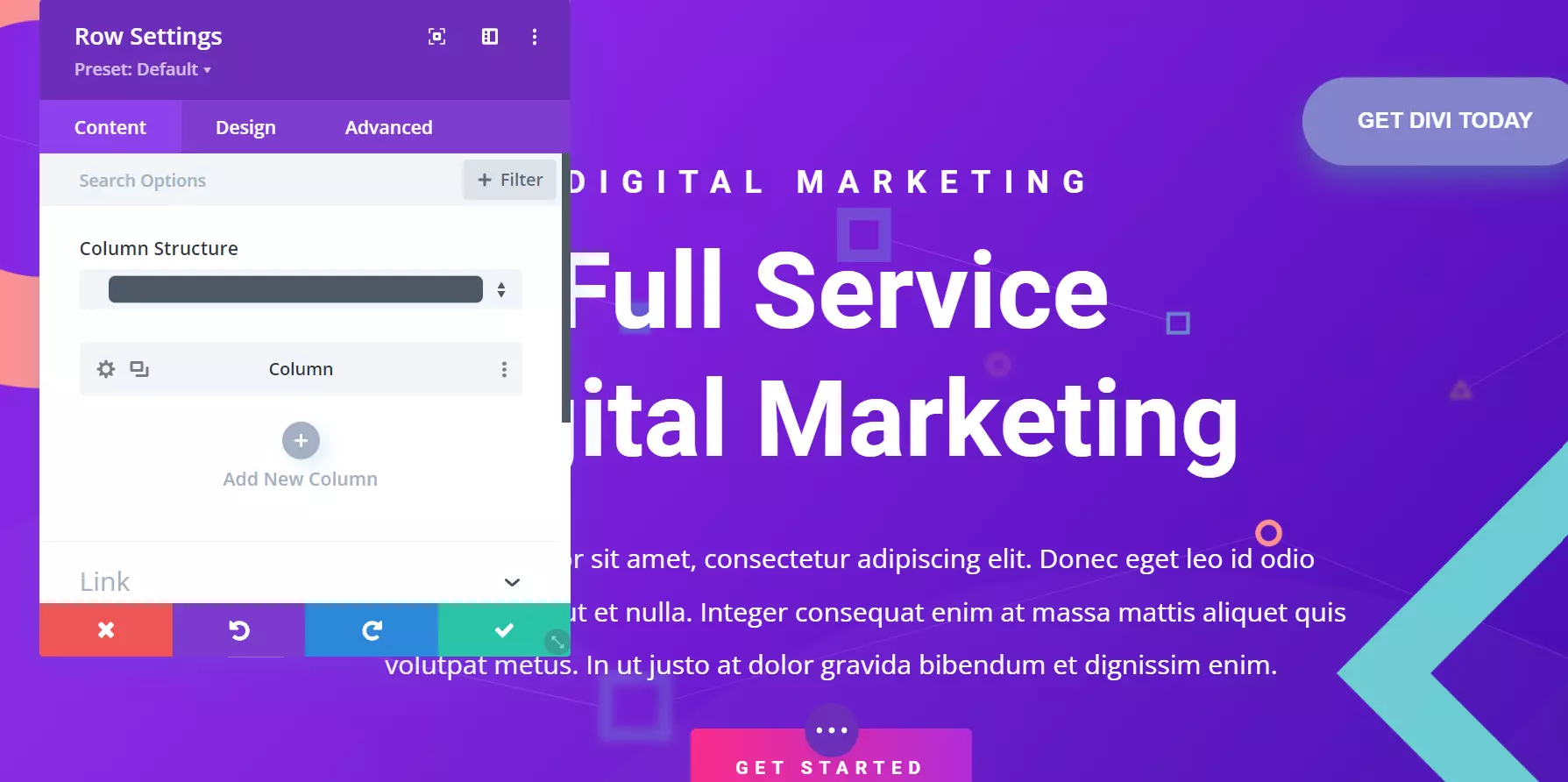
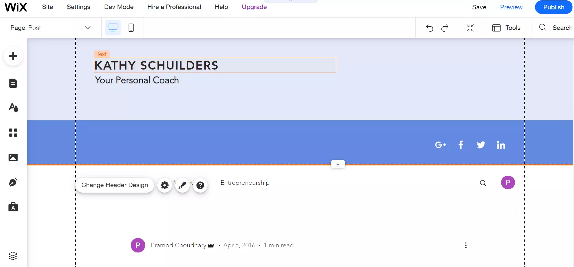
Wix ships with a bunch of pre-made layouts called Strips. Divi gives its users access to layout packs and layouts. On its marketplace, you’ll find 100+ layouts/templates grouped in these categories – art/design, business, education, event, online store, services, simple, technology, etc. You can redesign the layouts/strips to make them match your site’s color scheme and design.
The UI of the Editor of the two tools is different, but they are similar when it comes to functionality. When you click an element or section on the pages/themes, you’ll see some options below the section/element. When you click the gear/settings icon, the two platforms will open a popup/modal. You’ll find several settings for the element/section in this popup. When you tweak any setting, the tools will immediately apply the setting on the element.
The tools let users build a header, footer, or any other section of your website. In Divi, you can customize everything in detail. With Wix, you can customize only the basic properties of an element. For example, Divi displays these settings for a button in a modal:
- Alignment, text color, button text size, background color.
- Border width, border radius, button font, font weight.
- Icon (50+ icons to choose from), icon color, text-shadow.
- Margin/padding, box-shadow, filters, animation, transform, conditions.
- Visibility, transition.
Wix lets you change the following settings of a button:
- Text, alignment, theme.
- Animation, link.
Wix website builder supports buttons with icons. It also enables you to add an icon to a button. Unlike Divi, which shows a list of icons from its library, it shows an icon chooser form. You must select icons you’ve saved on your PC to use them.
Divi lets you switch from the WYSIG editor to Wireframe view/mode. When you switch to Wireframe view, you can move the rows and columns by dragging and dropping them. A wireframe is a valuable tool for building sites. It should be a part of every website builder. Wix doesn’t support Wireframe view. You can move the Strips anywhere on the page by dragging/dropping them, but the result wouldn’t look great.
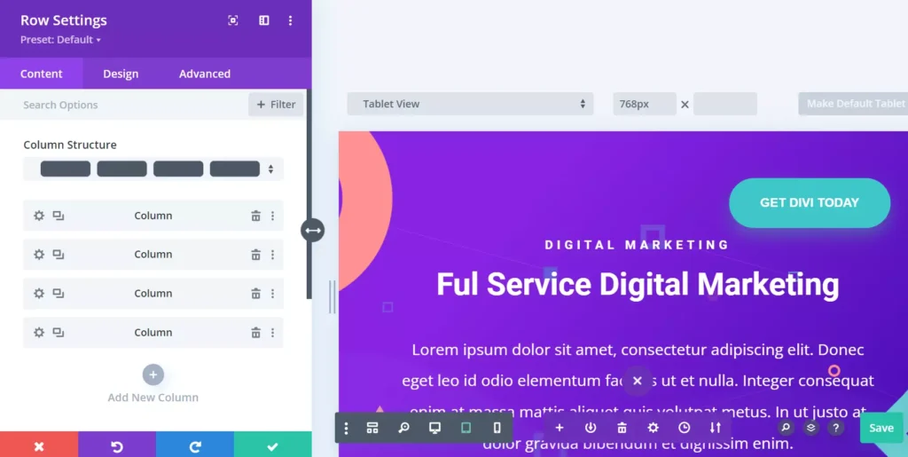
Sometimes, you change the appearance of an element and decide to keep it. A few minutes later, you find the design awkward. Both tools enable you to redo/undo changes.
Display conditions
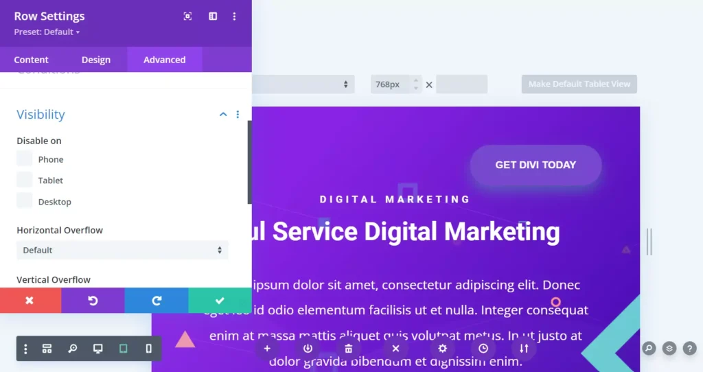
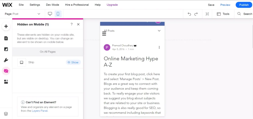
The site builders enable you to configure the display properties/settings with the help of their GUI. In Divi, you can hide any element of your choice on a desktop or phone by opening the element’s settings modal, opening the “Advanced” tab, and choosing the phone/tablet/desktop checkbox. As in Divi, it is easy to hide elements on desktops/mobiles with Wix. To make Wix hide a website part on mobile, you must switch to mobile view, click the element, and choose the hide option. You are not required to work on JS or CSS code to hide/show elements if you’re using one of these two tools.
Experience
Divi is smooth and fast. Wix can be slow and frustrating at times. When you click its mobile to desktop view switch button, the layout may appear broken. Also, locating options in this tool is not easy. I felt that Wix doesn’t let users hide elements on desktops or phones. After switching to the mobile view, I found the option to hide the element.
Storage memory
Wix website and business plan support a maximum of 35GB and 50GB storage memory. If you’ve bought an unlimited hosting plan, you’ll get unlimited storage space on the server i.e. Your website can store unlimited data on the server. Because of the low storage memory, Wix is not an excellent choice for video hosting sites or sites that are expected to grow in the future. WordPress, hosted on an unlimited shared hosting server, is an excellent choice for video sites. It is also suitable for small or large sites of any type.
Number of sites
A few months after launching a new website built using a website builder, many users may think of creating another site. Wix premium plan supports a single website only. To build another website, you must purchase its subscription plan again.
When you buy a license for Divi, you can use the theme on unlimited sites. Each website you build with Divi can look entirely different from the one you’ve created previously. Several top shared hosting companies have launched unlimited website hosting plans. The plans are a few cents or dollars costlier than single-site hosting plans. If you buy such a plan, you can create as many WordPress sites as you want with Divi.
eCommerce
Divi works great with the WordPress WooCommerce plugin. In the WordPress repository, you’ll find 100s or 1000s of extensions designed for eCommerce websites. Wix supports payments and some eCommerce functions, but Divi + WordPress is better because of the plugins WordPress offers.

